Bathroom #16: The Committee Designed This Bathroom
This bathroom is new to the game and I don’t know how I feel about it.
Normally, I walk into a bathroom and immediately have strong opinions about it. I know instantly if it’s magical, terrible, stressful, calming, charming, or a complete disaster.
You all know how opinionated I am about bathrooms.
But this one?
I just felt… meh.
And honestly that might be worse.
There were some genuinely good ideas here. Some really thoughtful touches. But there were also choices that made me stop in the middle of washing my hands and whisper “why?” to myself like I was trapped in a home renovation show.
The entire bathroom feels like it was designed by several committees who were emailing each other but never actually met in person.
It has no heart or soul.
Just blankness.
The Good
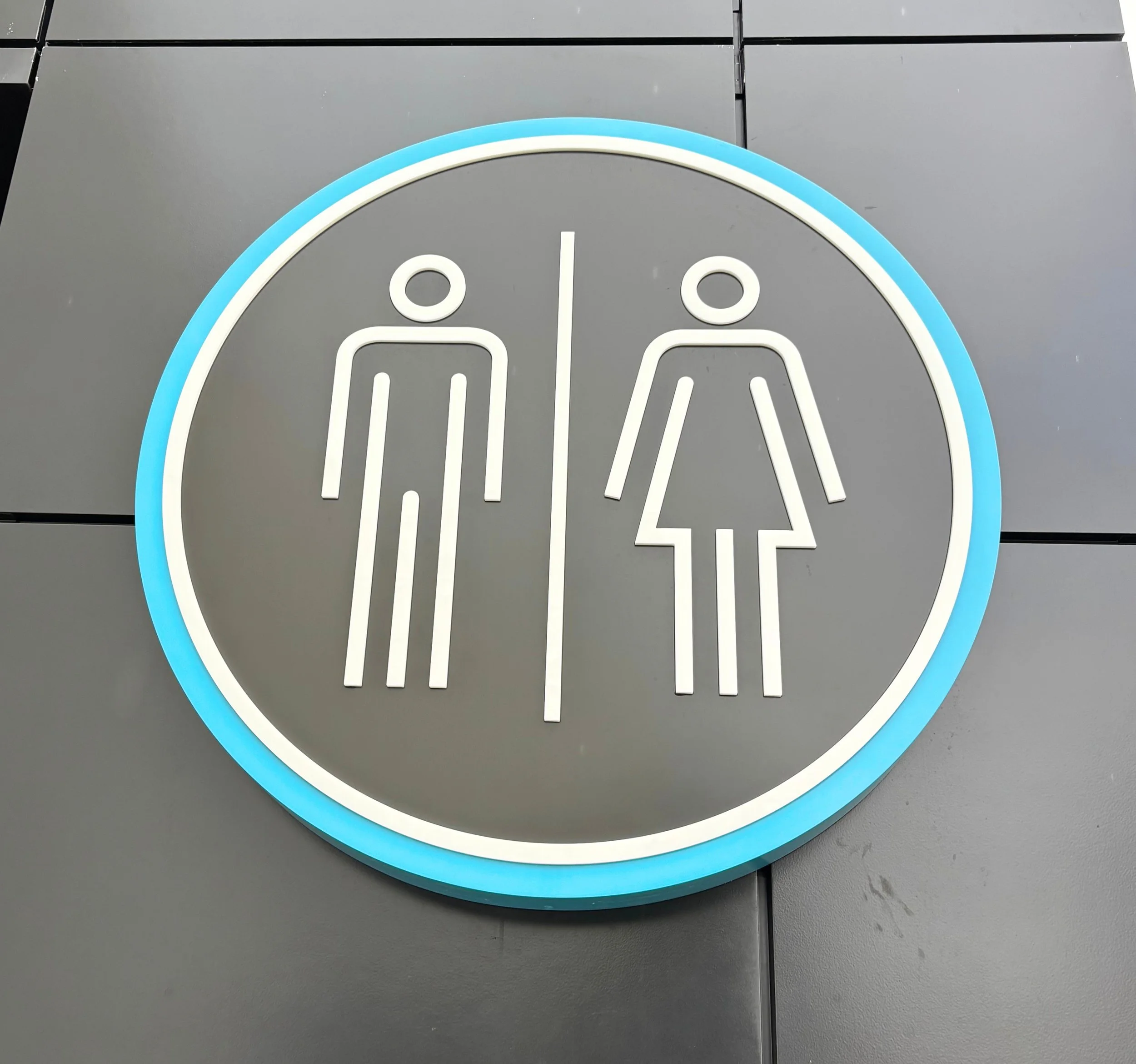
Signs
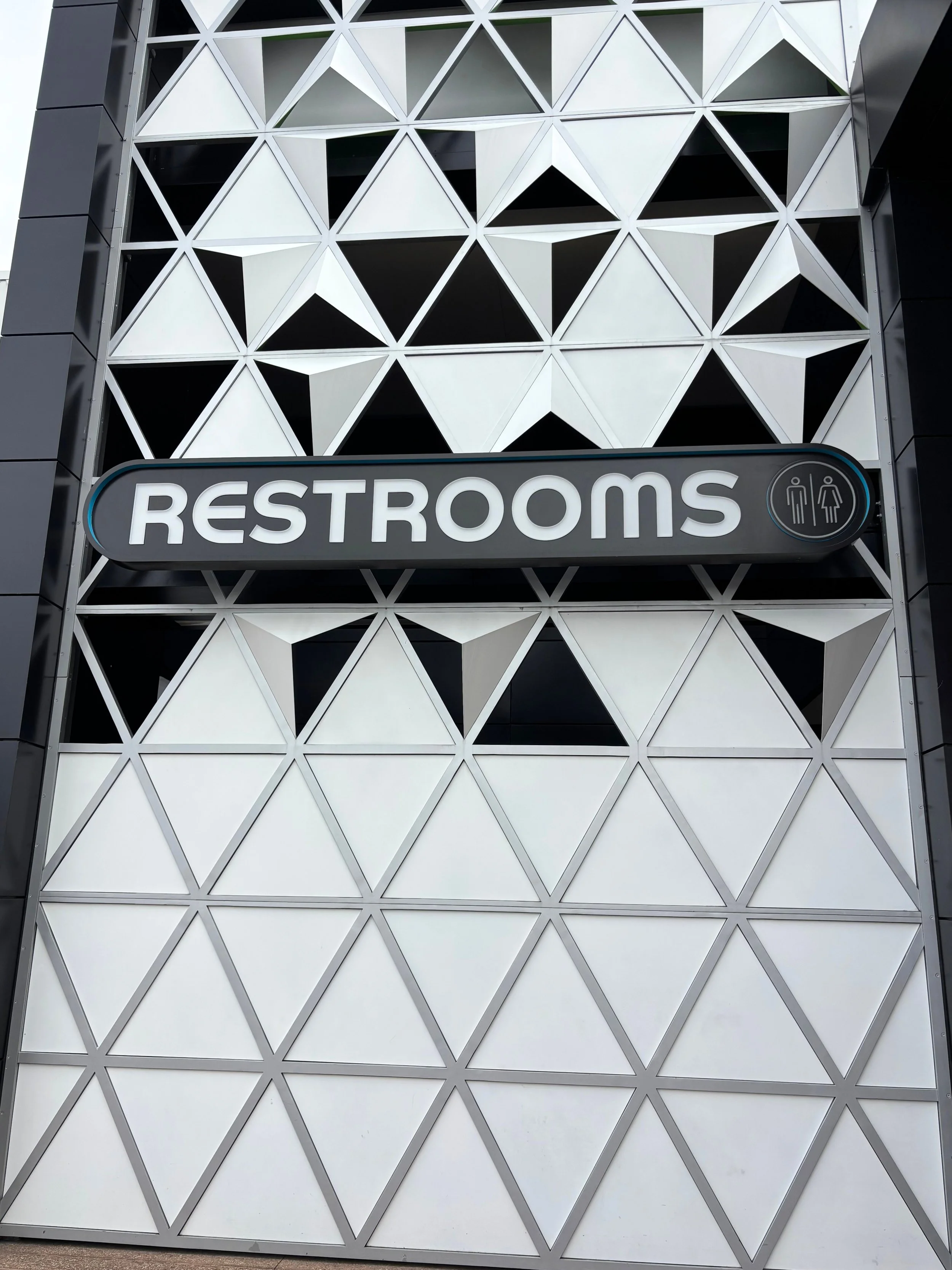
The outside signs are loud, clear, and impossible to miss.
This is the most aggressively announced bathroom in all of Disney World.
Disney basically looked at guests and said:
“YOU NEED A BATHROOM? GREAT NEWS. HERE IT IS.”
And honestly? I respect that.
You cannot miss this bathroom.
The futuristic style of the signs is actually really fun and exciting. The colors work. The vibe works. The entrance makes you think you are about to walk into some sleek, modern, EPCOT masterpiece.
And then you walk inside.
More on that later.
Cleanliness
This bathroom is extremely clean.
Which is honestly impressive considering how busy it constantly is.
The Cast Members are working overtime in there and it shows.
Everything was stocked, tidy, and well maintained.
I feel like the cleaning team deserves a standing ovation and possibly a vacation.
Reclaimed Water
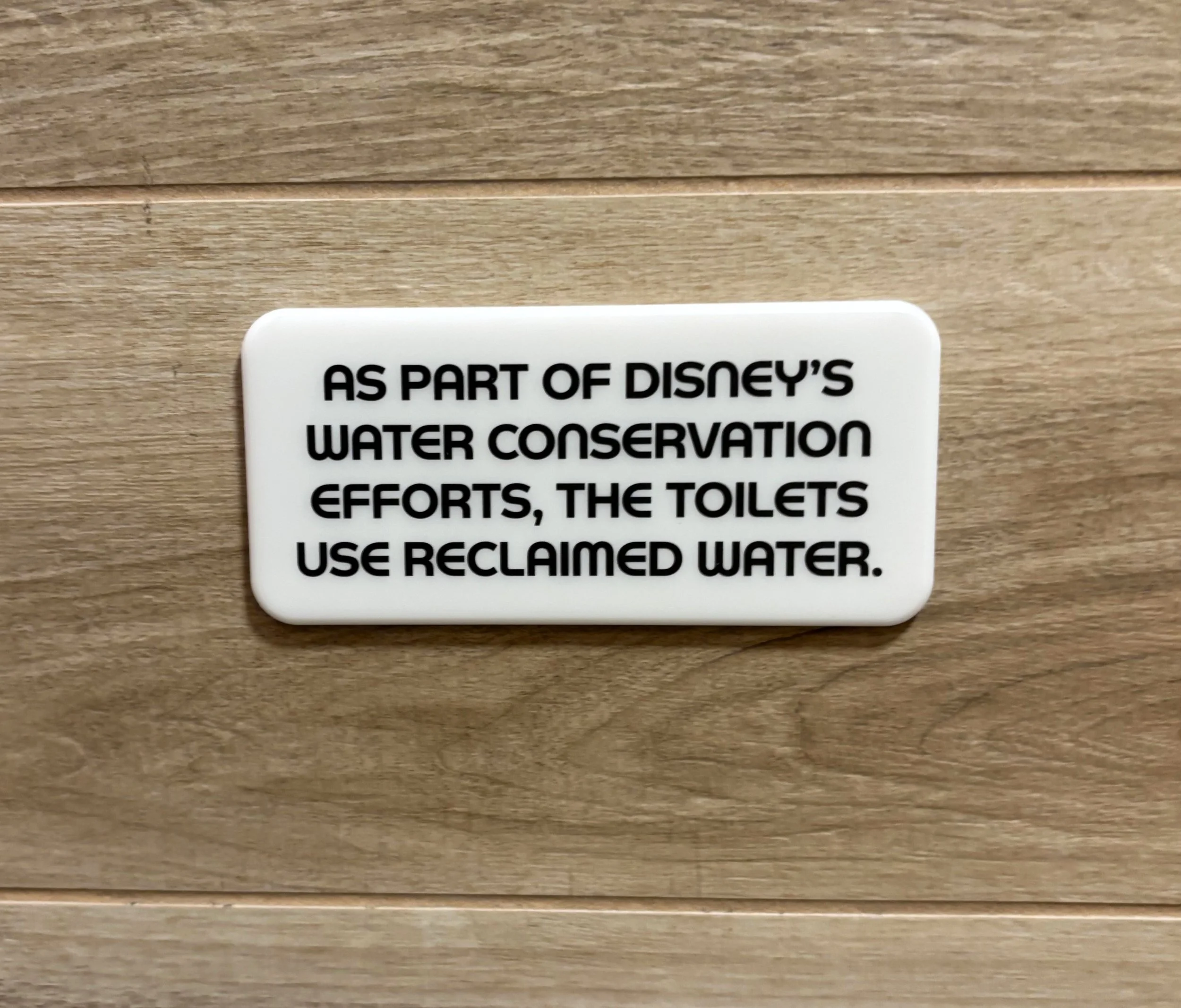
Yay! Environment friendly!
There is a sign explaining that the toilets use reclaimed water.
That is such a smart idea.
Honestly, every bathroom toilet should probably use reclaimed water if possible, so it was nice seeing Disney make an effort here.
Practical. Responsible. Good job, Disney.
More of this please.
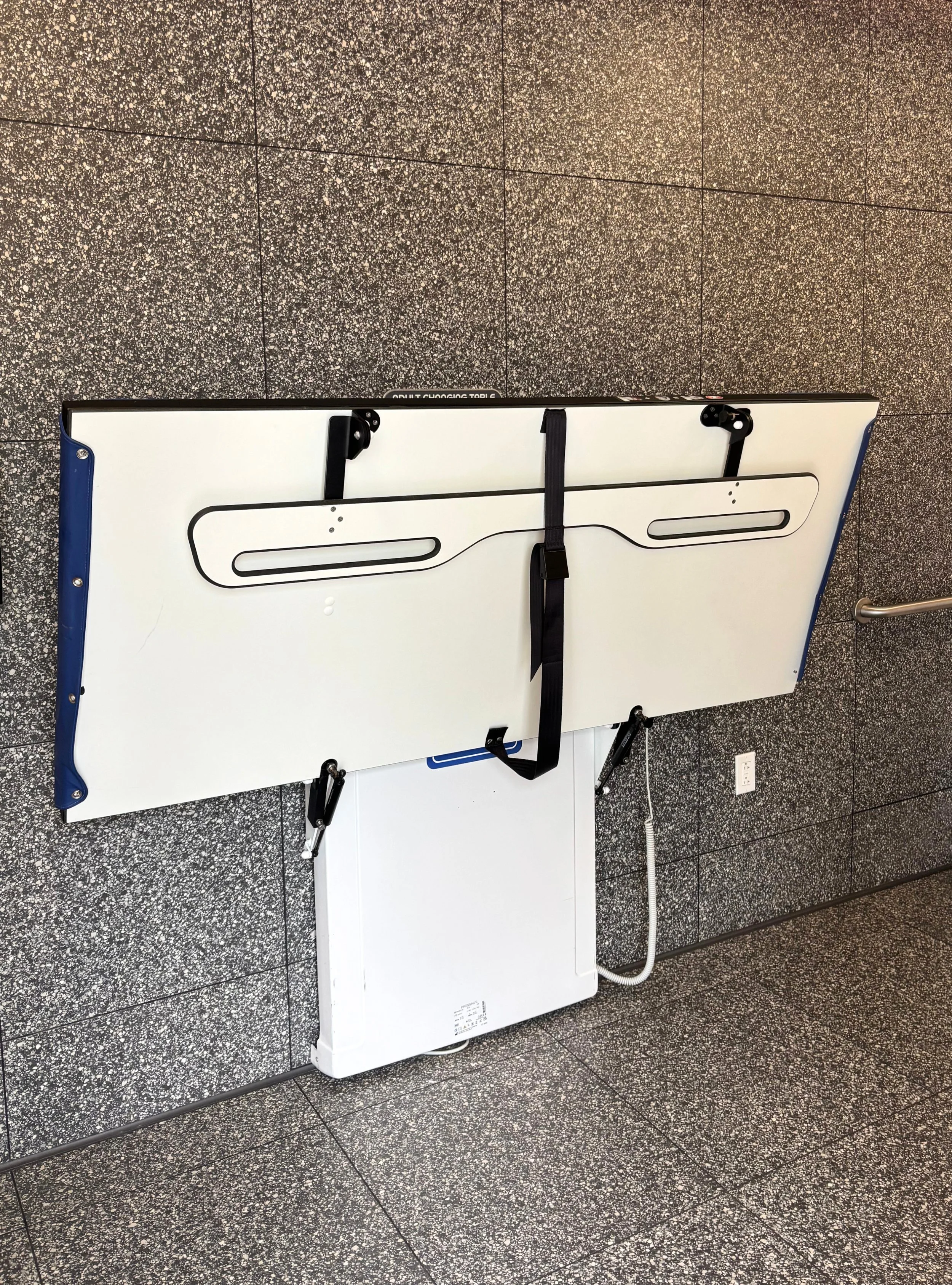
Changing Areas
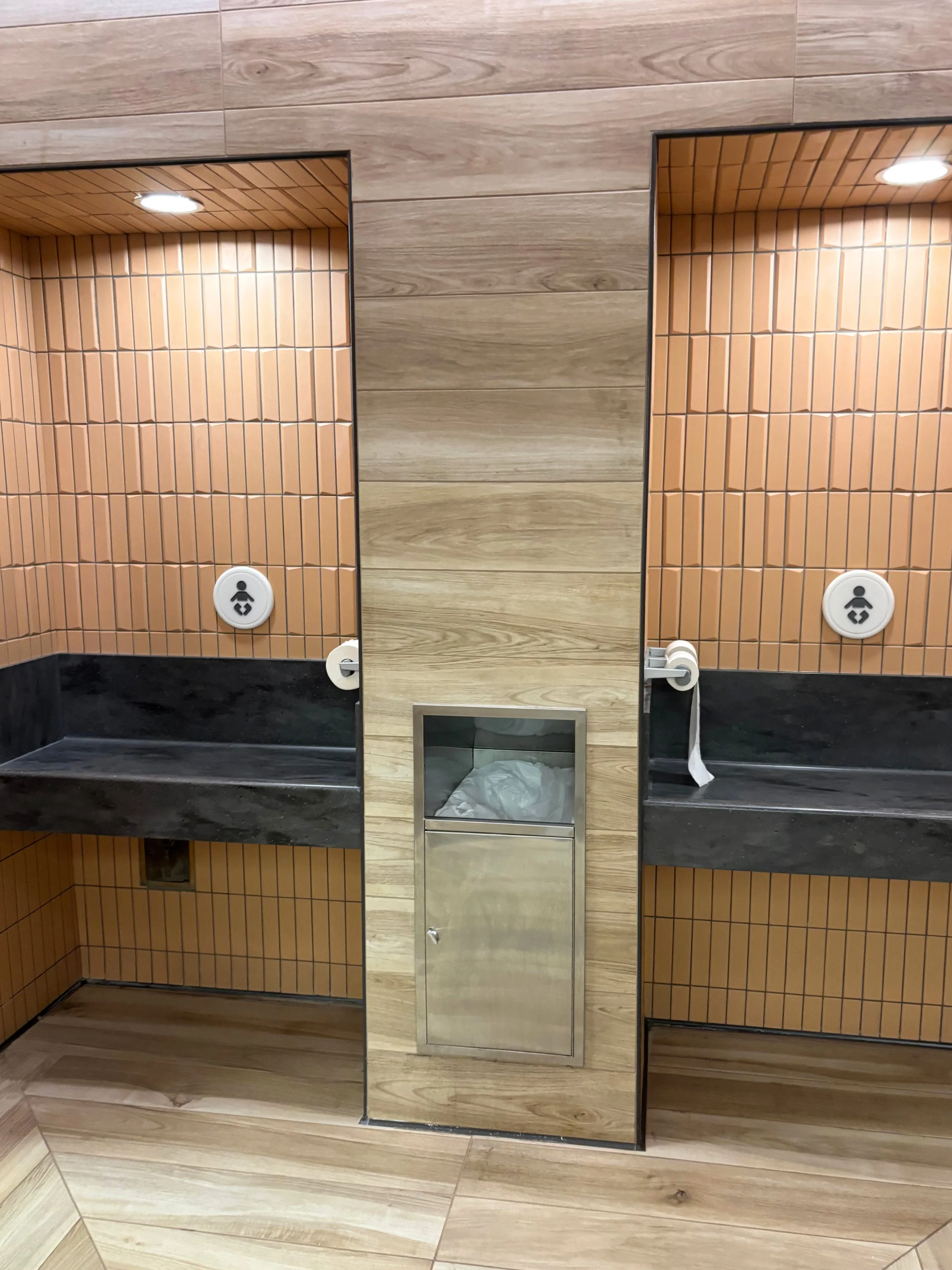
So spacious.
The changing areas are surprisingly well thought out.
There is toilet paper near the changing table which honestly made me laugh because my children would have absolutely destroyed that setup within minutes.
But I appreciate the thought behind it.
The area feels modern, useful, and intentionally designed.
Which makes what happens in the rest of the bathroom even more confusing.
Companion Bathroom
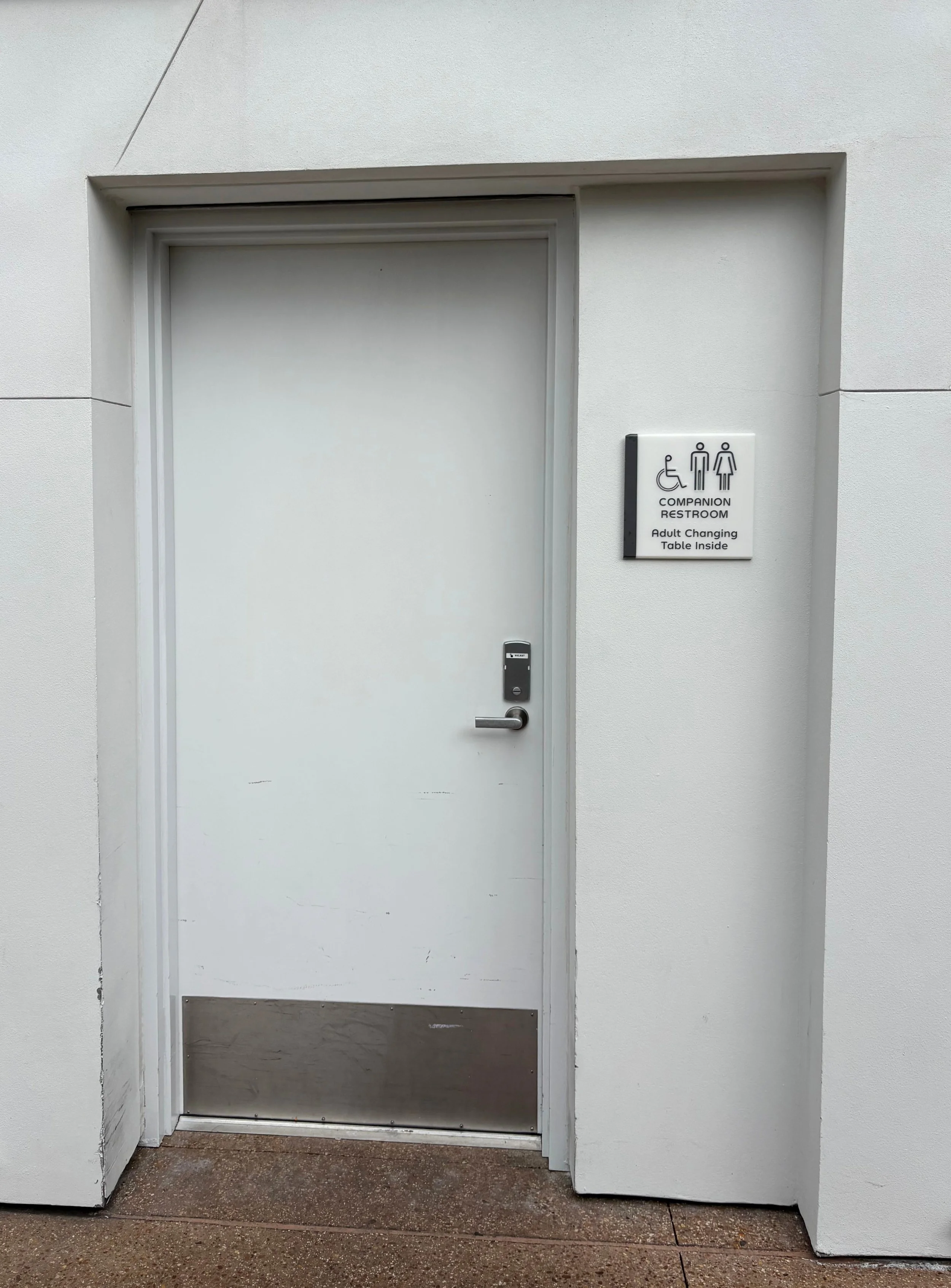
Right next to the men’s and women’s bathrooms is a companion bathroom.
And honestly?
This might be the best thing about the entire setup.
The bathroom is extremely large, very clean, and has a wonderful adult changing area.
The adult changing area is groundbreaking for Disney.
It is currently the only one on Disney property and that genuinely matters.
That kind of accessibility and thoughtful design deserves recognition.
Disney absolutely got this part right.
The Bad
The Color Scheme
What is this color?
Have I mentioned this bathroom is brand new?
BRAND NEW.
It could have been any color.
Any color at all.
The signs outside are futuristic and beautiful.
The doors are grey with sleek metal accents.
The changing areas use browns and greys that feel modern and calming.
Everything matches.
Everything flows.
And then suddenly…
BAM.
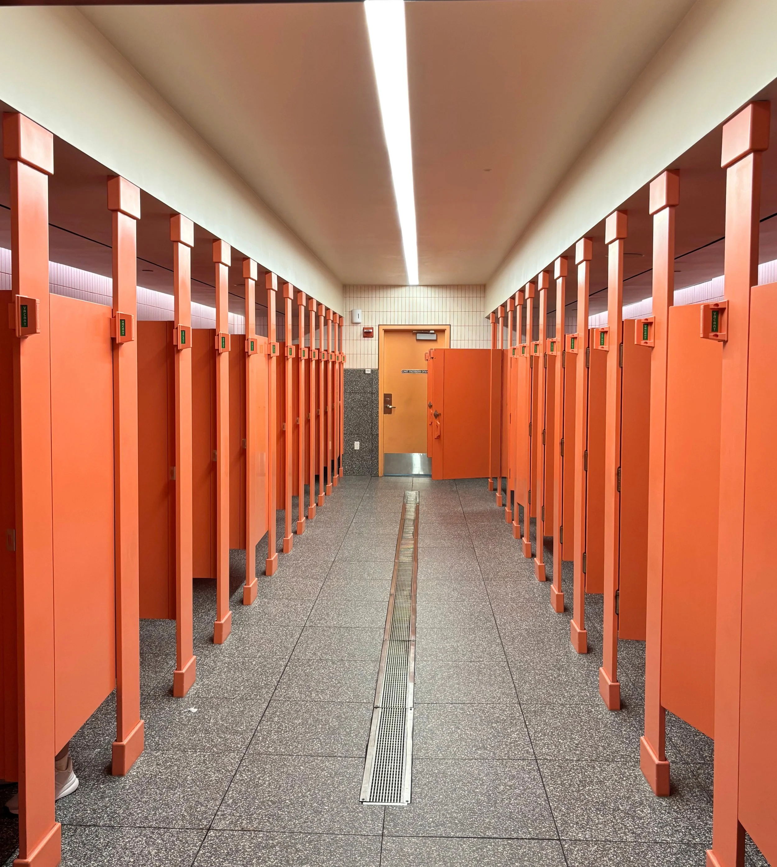
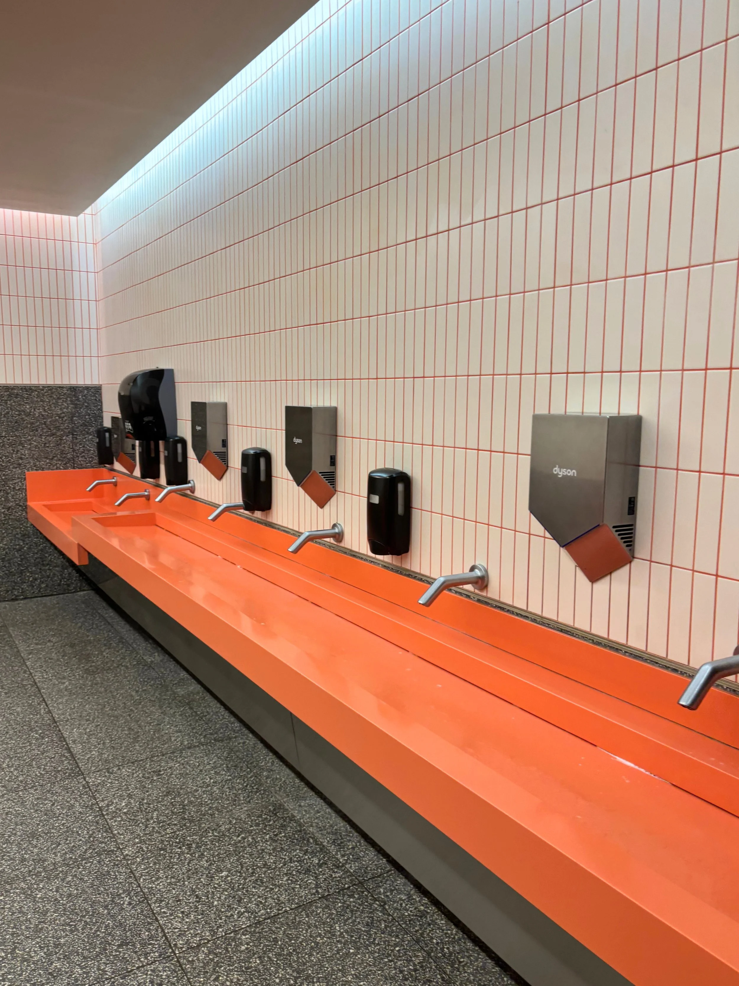
The actual bathroom is bright peach and orange.
Not soft peach.
Not warm terracotta.
Not stylish retro orange.
No.
This is the kind of orange that attacks you emotionally.
The stalls are bright and ugly.
The sinks are bright and ugly.
Just why?
The whole room feels like someone accidentally selected “sunset explosion” from a 1997 office building catalog.
Why.
Who approved this?
Who looked at these samples and confidently said:
“Yes. This is the vision.”
Maybe someone involved was color blind.
I know. Bad joke.
But the colors really are THAT bad.
The Design
Again.
This bathroom is BRAND NEW.
And somehow it already has one of the worst layouts Disney has designed.
The overall bathroom is large.
But the actual stall area feels cramped and claustrophobic.
It is so tight!
It feels like the bathroom equivalent of trying to merge onto I-4 during rush hour.
There simply is not enough room for the number of people this bathroom attracts.
And remember:
The giant signs outside are basically summoning crowds like a bathroom bat signal.
The sink area is also too small.

ugh
There are not enough sinks.
I had to wait in line to wash my hands.
Then wait again to dry my hands.
That is ridiculous for a brand new EPCOT bathroom.
Disney can do better.
And honestly?
Disney should do better.
Official Ruling
This bathroom had so much potential.
It is clean, modern, accessible, and filled with genuinely thoughtful ideas.
But then Disney made choices.
So many choices.
And unfortunately some of those choices feel like they were made at 4:47 PM on a Friday right before everyone left for the weekend.
The futuristic signs promise an EPCOT masterpiece.
Instead, you enter a cramped peach-colored stress chamber with not enough sinks.
The companion bathroom and adult changing area deserve applause.
The orange stalls deserve a formal apology.
Final score:
Good intentions.
Bad execution.
Emotionally confusing bathroom.
There are genuinely smart, thoughtful, modern ideas here.
The companion bathroom is groundbreaking.
The cleanliness is impressive.
The reclaimed water initiative is wonderful.
But then Disney wrapped all of those good ideas inside an ugly color palette and a cramped layout that already feels overwhelmed.
So I keep going back and forth in my head.
And unfortunately…
I think the bad outweighs the good.